Changing the way scientists communicate
We were approached by a start-up company that was trying to revolutionize scientific figures, with their flagship SaaS/PaaS Cloud application designed specifically to address the needs of research scientists.
It became apparent there was a great opportunity to offer a key feature that was a true game changer for their core users (Pharma, universities, and research institutions), and focused our efforts on creating a Collaboration and Communication feature with which they can dominate the market.
The Challenge
Focusing on features goals
Scientific Figures aims to fundamentally change the way scientists share and communicate visual data.
As it currently stands, there are little to no existing online design or data visualization applications which are tailored around the unique way scientists work and collaborate to share their research and findings.
To coincide with an industry conference where the program was scheduled to debut, our team was under extreme pressure to determine the most beneficial and effective route to discovery.
Since I needed to get the experience right the first time, it was best not to restrict ourselves to previous research, which didn’t focus on the current goal, and tailor the project with our own findings.
My Role
Experience Strategy
- UX lead, producing all major deliverables and presenting them to the stakeholders
- User research
- Information Architecture
- UX & UI design
- User testing
- Interface Design
Offered MVP recommendations.
Scope: 3 weeks
The Approach
Strategy of real needs
Although our initial brief was to provide feedback on the current iteration of the product as a whole, I stressed a more strategic approach in which we focus on identifying the users’ daily workflow, in order to design the software to fit organically with their real needs.
Guiding Principles and Direction
We discovered that while the scientific community is very collaborative and globally interconnected, at the same time are very concerned for their IP (intellectual property).
Key Research Questions:
- What does the scientists daily routine look like? What is their workflow?
- What makes collaborative tools enjoyable or painful to use?
- What is their ideal way of collaborating and communicating?
- Is there a difference in workflows between research disciplines?
The Discovery
The discovery phase was a quick, high intensity effort that allowed us to review the competitor landscape, understand the client’s vision, and begin research into the user needs, behaviors, and pain points.
Our research revealed that while there was no direct competitor, a lot could be learned from other collaborative tools on the market.
This initial heuristic analysis informed, and was followed by user interviews with two primary goals:
- The first was to study scientists’ work styles and their workflows.
- Second, was to understand and learn about their behaviors, and insight into their current collaboration and communication tools and methods.
I made it a priority to recruit for our user testing and interviews researcher scientists from a wide verity of industries, genders, and geographically spread out as much as possible in order to avoid cultural and demographical bias.
We used Affinity Mapping to synthesize and identify insights in the user interviews, by first categorizing the responses into four main themes: Pain, Pleasure, Behavior, and Context. Then we grouped them again by users’ Needs, Wants, and Pain.
The emerging themes were surprisingly consistant across all of the user groups, regardless of industry, gender, location, etc. as verified by surveys.
Needs
Wants
Pain
We used personas consistently throughout the project to guide design decisions, priorities, and create empathy amongst the client and our team.
Despite our best attempts to hypothesize different person archetypes, the overwhelming and consistently similar needs, wants, and pain points indicated clear pattern that led to Sanlin the Scientist as the primary model persona.
The Vision
Visualizing the end-to-end
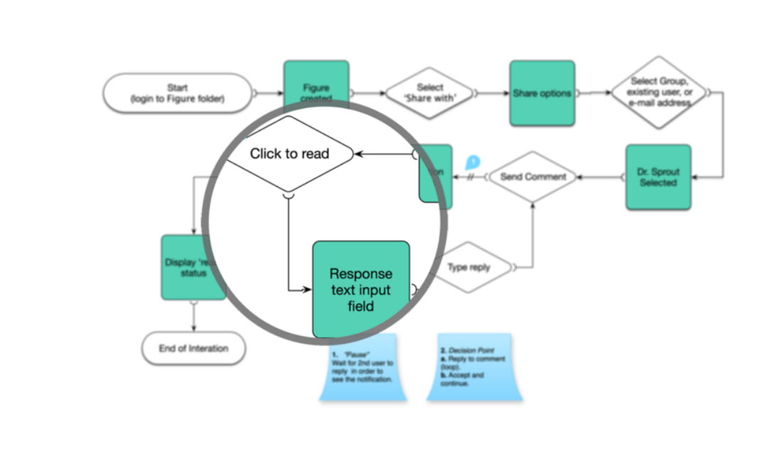
We used experience mapping techniques to visualize and communicate the users end-to-end experience. This allowed us to present user pain-points and see where we needed to focus our attention.
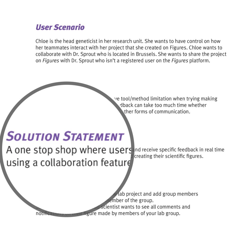
Our vision was to create a one-stop-shop where users can create and edit their scientific figures. Using a collaboration feature to receive specific feedback in real time. This, with the peace of mind that their IP (intellectual property) stays well organized and their own.
Process
Designing for what users want to know, do and feel
Synthesizing goals from our research served as a lens through which we could consider not only what the app should do, but also how it should feel. We believed this would be the difference between delivering a good experience and a great one.
Storytelling About Ideal Experiences
Knowing who I was exactly designing for allowed me to ask how we can fit in enhance the work and experience of our users. I imagined ideal experiences and focused on how our persona thinks and behaves rather than getting into specifics about interfaces, technologies, or business goals.
Extracting Requirements
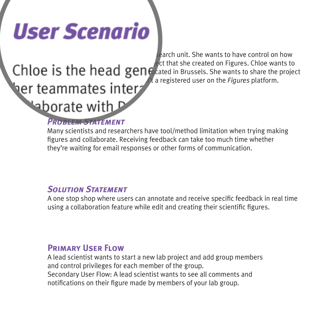
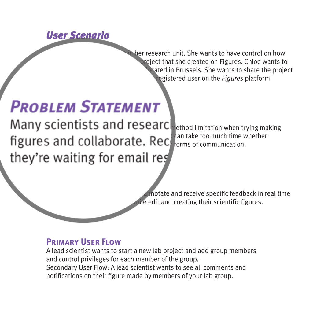
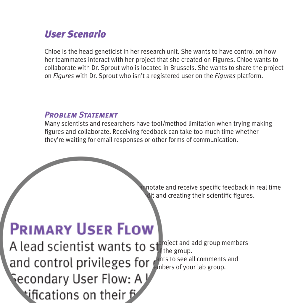
The user scenarios allowed us to work fluidly and explore concepts that could be easily communicated with our team and client. They formed an informed the problem and solution statement, as well as the backbone of the requirements.
Combing through our research and brainstorming the different things people do during and after their workday allowed me to come up with a broad set of tasks—quickly.
Setting the Design Direction
Because we were working within an existing UI and established brand, initially we were faced with some challenges in pivoting the Information Architecture (IA) to align with the findings from our research.
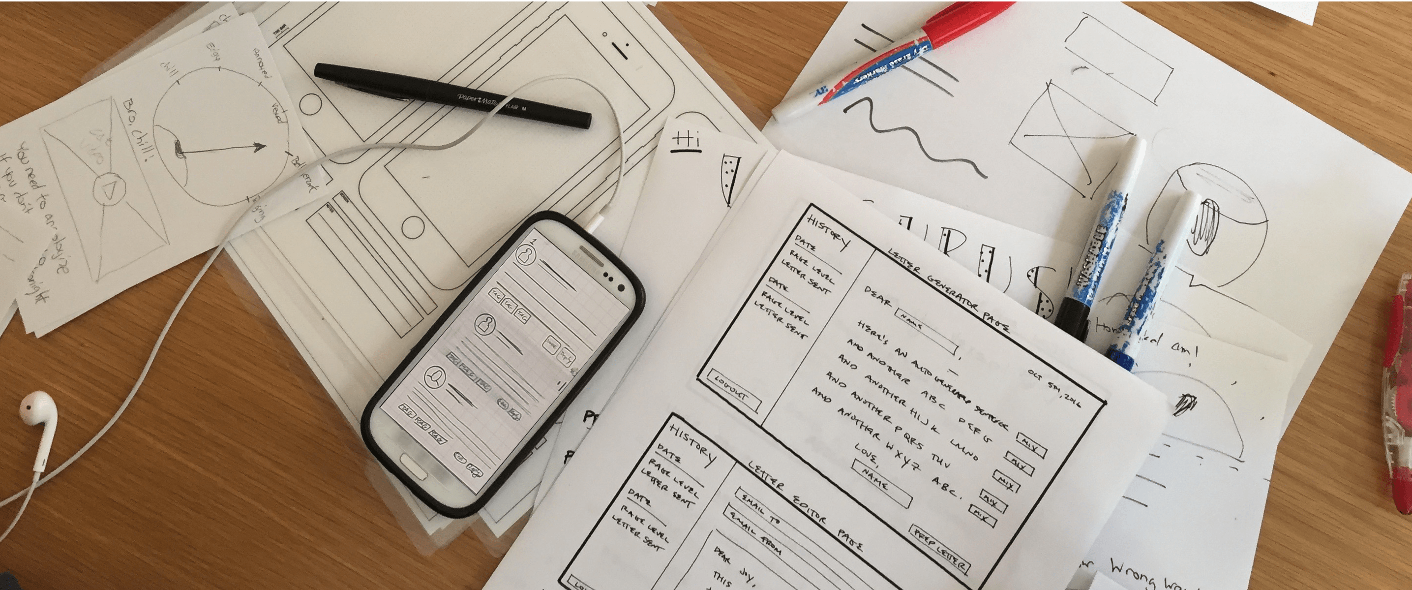
Through the use of sketching and storyboarding, I generated stacks of ideas to illustrate to the stakeholders UI arrangements and interactive behaviors. Developing this high level design language facilitated the clients ability to understand our vision. To their credit, how’s the vision developed into something tangible, they were open to make changes to their core UI, IA, and app behavior to expand the research based recommendations I made—sitewide.
Inclusion
Before
After
Websites and apps can be designed to be understood by the widest possible audience. This includes accommodating things like color blindness, seizure and migraine triggers.
I put special focus on reducing and simplifying the cognitive load in the interface. This is not only a moral (and often a legal requirement) to support scientists with disabilities, but equally effective supporting scientists of all walks of life maintain their focus.
Structuring the Experience
After identifying the main ‘plot-points’ in our scenarios, I defined the primary pathways our personas would explore through the app. I begun to think about particular usage contexts, the opportunity they present and how elements manifesting themselves in the interface would help to support the user.
Detailed Design
Introducing… Scientific Figures
Below is a live (clickable) inVision™ prototype of some of the key screens.
Define the MVP
Using the Design Studio methodology has proven an effective tool in identifying and defining the MVP (Minimal Viable Product) for this project. Including the stakeholders in the process ensures that all possible viewpoints are heard and considered. As well as, contributing to the sense of ownership they take back with them to their respective teams, where they act as ambassadors for the chosen direction.
The User Flows and Personas we created pointed to the Collaboration Threads and Revision Control as key features that would capture the desires and needs of the target users and make them cheerleaders in their companies and colleagues to embrace and adopt usage of the app.
Focus on Workflow
The main screen was redesigned to align with the users ‘morning routine’. They get a quick overview of their project, allowing them to quickly and easily delve into the most recent updates in their research.
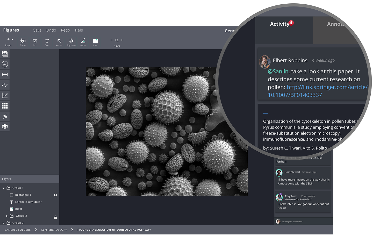
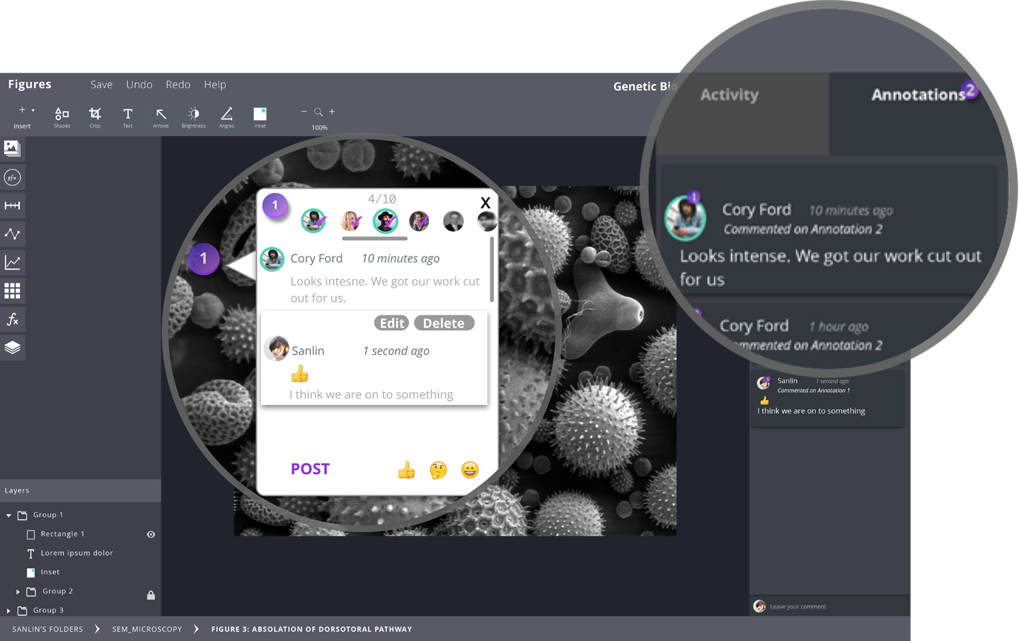
All the updates, and new comments were organized under the Activity Tab (which was made the default view) so they can’t miss a thing.
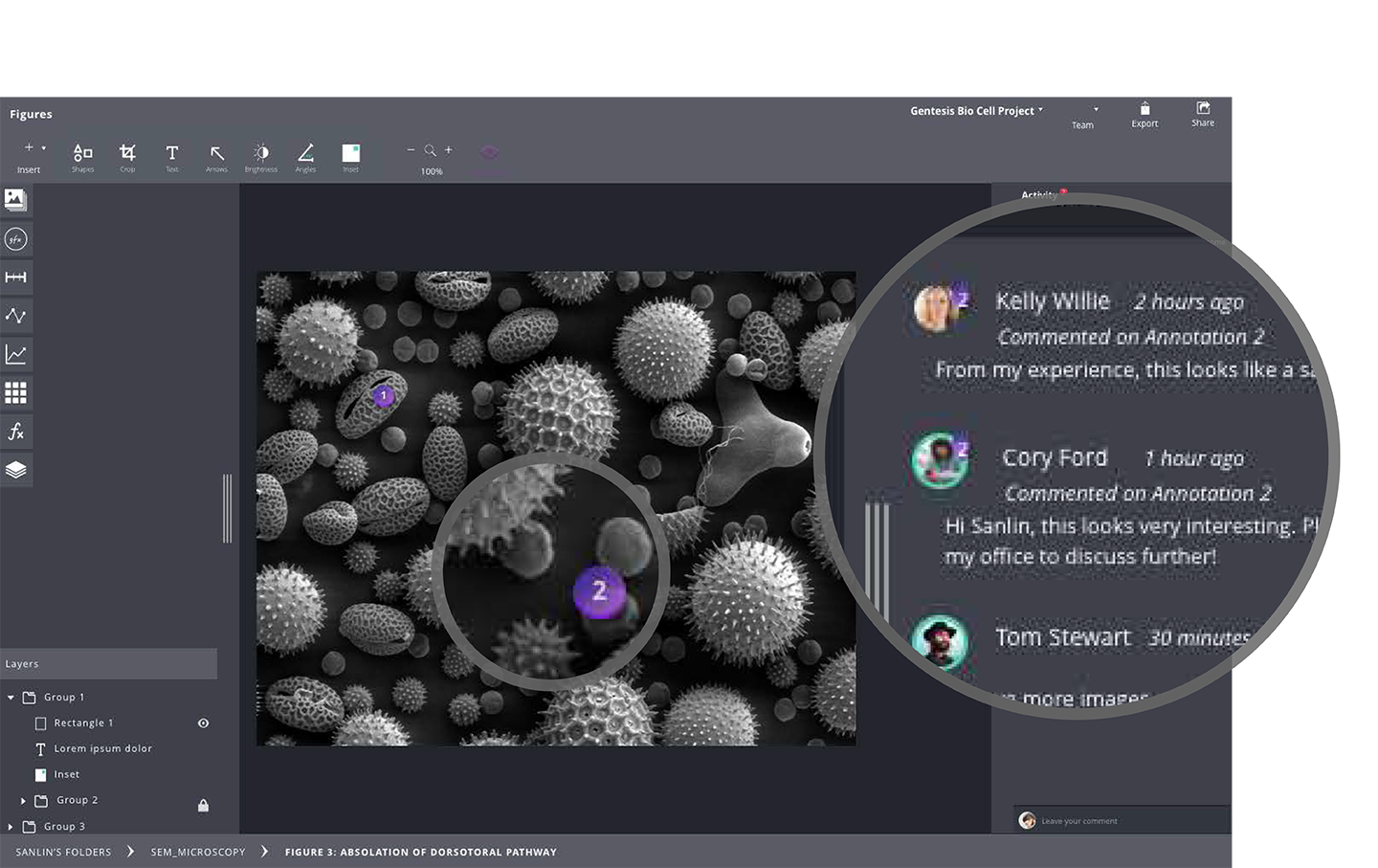
Annotations, notes, remarks, links, and discussions are both highlighted with an overlay on the images, as well as, listed chronologically in the Annotations Tab.
Within each annotation, the lead researcher is not limited to just comment on each remark. Rather, the thread is organized, and can be grouped and filtered to easily follow the development of an idea.
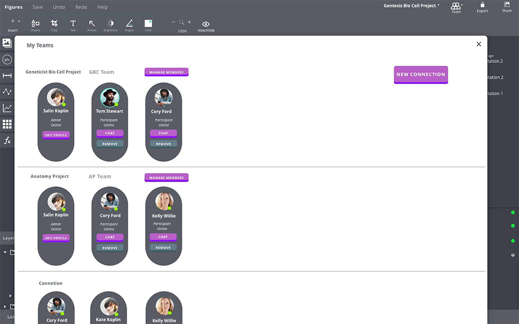
Intellectual property (IP) was another very important issue that concerned users on a daily basis. For this reason, we emphasized clear and quick view of the Team and Access Control on the main screen UI.
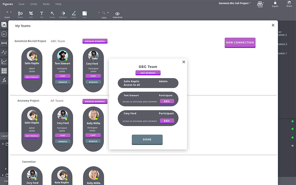
The Access Control page was designed with simplicity and clarity in mind, and a zero learning approach. The page colors are mirrored to those of the main UI to visually differentiate it from other sections.
.Each group was graphically broken down, and each user is presented simply, without any submenus that would require extra steps in order to view their status. Changing the permissions is all within a single click away.
Designed for Function & Confidence
The interface design as a whole strives to evoke confidence. It does not contain UI-bling or unnecessary elements. We opted for clear legible typography—choosing colors that are high contrast, yet not straining on the eyes that wont negatively affect those working in darker environments.
The Impact
The true impact UX research can have on a company, regardless of its size (be it a start-up or Fortune500), is not just measured in terms of dollars and cents. The true value comes from understanding who exactly your users are. What are the real needs, wants, and pain points. How they work and live.
It all boils down to people. Offer a solution that solves a real problem, and in return they will develop a deep relationship with you.
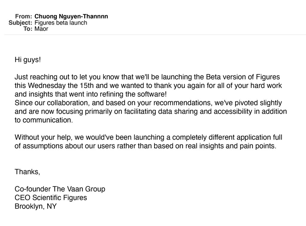
“Without your help, we would have been launching a completely different application full of assumptions about our users rather than based on real insights and pain points.”
— CEO Scientific Figures


