
To comply with my confidentiality agreement I have omitted and appropriated confidential information. These designs are a reinterpretation of the original.
The Challenge
As a sleep obsessed company, we were approached with the challenge to identify what are the next steps Casper™ can take in order to enhance their users’ sleeping habits, and improve their waking lives.
My Role
I was part of the pitch team and responsible for the experience strategy and design of the iOS app alongside two other designers in collaboration with engineering to validate viability of the proposed tech.
My involvement included
- Research and Analysis
- Wireframing
- Information Architecture
- User Testing
- Prototyping
- Stakeholder communication and presentation.
The Approach
Make sleep better make better living
Trusted with an “open-ended” project such as this is always a challenge, as you are provided with very few restrictions, while offered a unique opportunity to bring together the true needs of the users. Illustrating to the stake holders how this will fit with the strategic goals of the company’s future.
This presented the possibility to empower people (users) to get the most out of Casper’s products. Designing an transparent and intuitive solution for improving their sleeping habits, to have more fulfilling days.
A collaborative culture with lean UX
We opted for a lean approach which emphasized rapid sketching, prototyping, user feedback and design mockups. This created early team‐wide alignment, sparked tons of great ideas and created a strong sense of ownership across different disciplines within the organization.
I crafted an experience strategy outlining our phased approach and direction for the app.
Ample opportunities for input at all stages of the project built trust and created a comfortable environment to share ideas—forming a partnership which will serve much value beyond this phase.
Discovery
Our starting point began with the Casper brand itself. Initially, we wanted to understand Casper’s value proposition, target consumer, brand ethos, and brand voice, review the competitor landscape and begin research into user needs, behaviors and pain‐points.
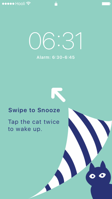
Our research revealed that a significant section of the users, claimed to have bad habits regarding ‘snooze abuse’ and were motivated to use a ‘sleep app’ if it provided actionable insights that were related to their daily routine.
In assessing the market landscape of sleep applications, a very saturated market, we identified a few key takeaways that provided opportunities on which we could build to solve some of the main pain-points that were identified during user research:
Opportunity
- Providing insights from tracking data that teaches users how to use this data in a meaningful way.
- Including additional sound and music integrations to enhance customizability.
- Devise an all encompassing solution as oppose to niche functionality.
- Eliminate the need to purchase additional hardware such as a wearable to promote adoption.
Beyond functionality, the degree of usability and emotional connection an app fosters determines how “sticky” it will be.
To test our assumptions that came out of the research we adopted several user centered design techniques (emphasizing on the ability for rapid response and ideation). In particular we were aiming to dig a bit deeper into the following themes:
- What prevented people from getting a good nights sleep.
- The degree of experience users had with sleep applications and other sleep improvement methods.
- How people perceived the quality of their sleep.
We used personas constantly throughout the project to guide design decisions, priorities, and create empathy amongst the client and our team.
Our research revealed that the core pain points of the various persona archetype tested were surprisingly very similar. This led us to hypothesize an overarching persona that shares similar pain-points, wants, and needs within our defined target user group.
Solomon the Snoozer is not satisfied with the quality of the sleep he is getting. He’s used sleep apps before, but was left without relevant context or suggestions how to structure his life to enhance his wake/sleep hours and overall day. He doesn’t want to try and understand an application, rather wants the application to understand him.
The Vision
Visualizing the end‐to‐end
We used experience mapping techniques to visualize and communicate the users end‐to‐end experience across various touch‐points. This allowed us to represent user pain‐points and see where we needed to focus our attention. Mapping out the users emotions was key to setting expectations about the aspirational emotional state we were aiming to design for.
(best) sleep for all
Even with a great mattress, there are environmental and behavioral factors that get in the way. To date, the competition focused on ‘raw data’ collection, and users were left at their own peril attempting to decipher how to adjust their sleep hygiene routines.
We envisioned a holistic solution that will solve this dilemma by providing actionable, time and place relevant instructions that users feel it made them better.
In essence, the Casper™ DreamTeam companion app will serve as a bridge between the users’ sleep and waking lives by gathering information from both states and delivering advice that will improve their sleep habits.
Sleep is just one side of the story, and linking this data to what’s happening in their waking life would be key to motivate users to act on this advice.
Process
Our starting point began with the Casper brand itself. Initially, we wanted to understand Casper’s value proposition, target consumer, brand ethos, and brand voice.
Casper’s marketing and business model is intended to convey to their target audience that their products were designed with their needs in mind akin to the way the iPhone offers very limited models to its entire user base. Moreover, their friendly tone and e-commerce based business model diverges drastically from the stereotype of a mattress sales person trying to push a certain model to meet sales quotas.
Surveys
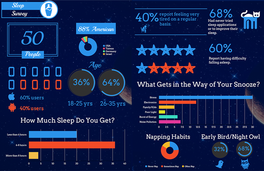
We surveyed 50 people in order to learn more about their sleep behavior as well as their experiences with sleep related applications.
Interviews
As Casper products are not targeted towards those with muscular-skeletal issues, we chose a 50/50 mix of healthy people who had experience with sleep apps as well as those that didn’t to accommodate for multiple user types.

—Vincent

—Amanda

—Mike
Affinity Mapping
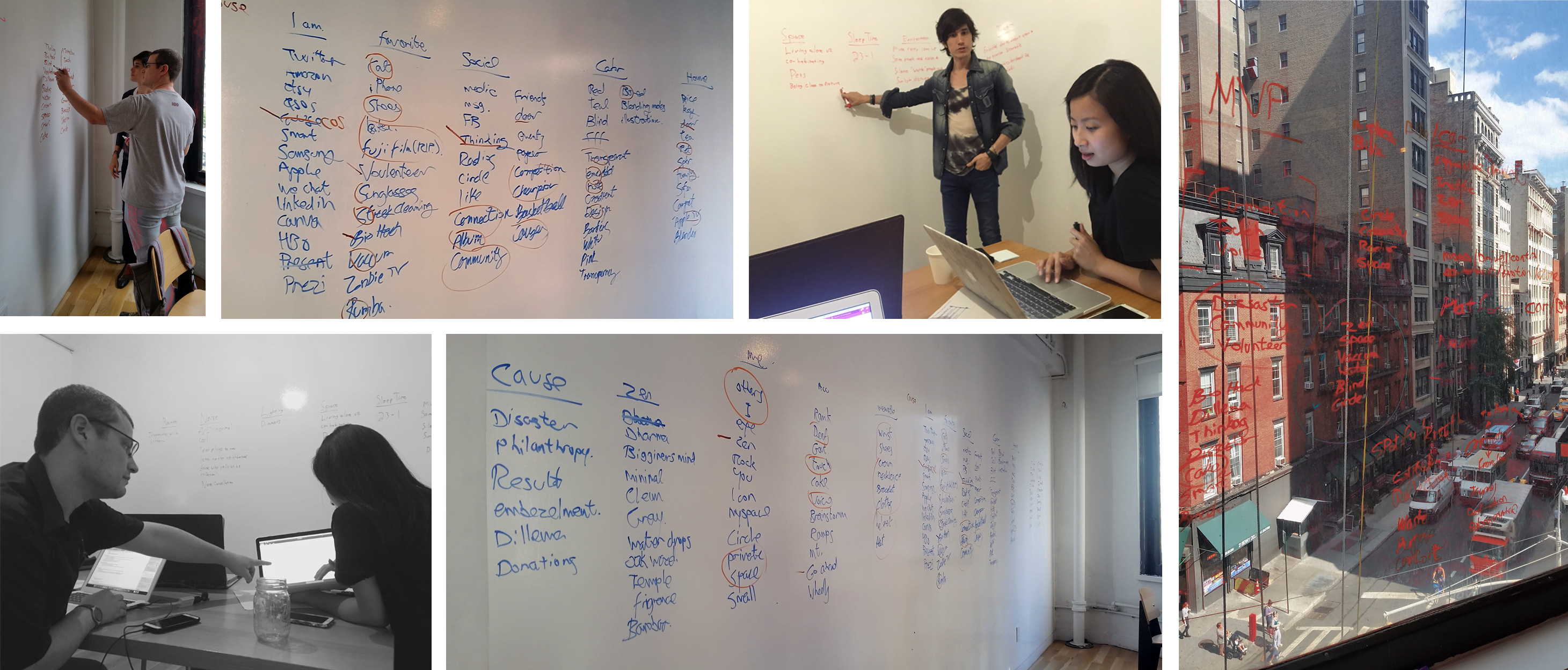
We assembled all of our data from the previous three phases of research and compiled them into emerging themes from which we would prioritize features and arrive at a problem statement and persona.
Detailed Design
Snoozing
Naturally Wake Up

Noise Pollution
Sleep Apps
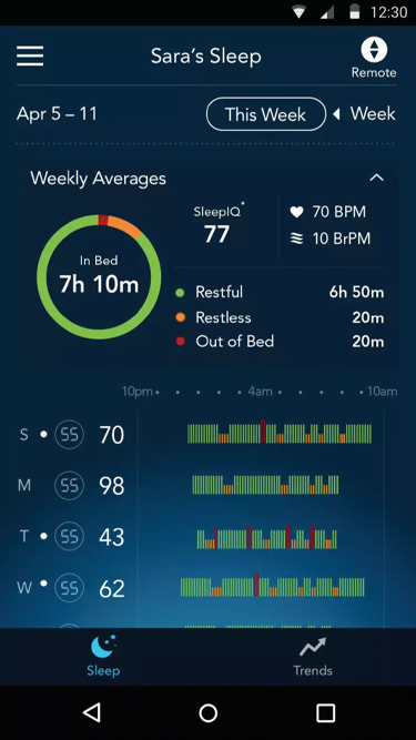
With the exception of one, our interviewees expressed interest in sleep apps, but found they didn’t provide them with any meaningful advice on how to sleep better. They also expressed that they didn’t want to have to spend time understanding raw data.
—Screenshot ©SleepIQ
Motivation
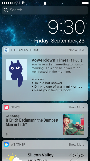
Our interviewees didn’t see any strong correlation to sleep tracking data and their lives. They would be more inclined to act on the data provided if it was somehow linked to their daily routine.
User testing
Our starting point began with the Casper brand itself. Initially, we wanted to understand Casper’s value proposition, target consumer, brand ethos, and brand voice.
Casper’s marketing and business model is intended to convey to their target audience that their products were designed with their needs in mind akin to the way the iPhone offers very limited models to its entire user base. Moreover, their friendly tone and e-commerce based business model diverges drastically from the stereotype of a mattress sales person trying to push a certain model to meet sales quotas.
Successes

Epilog
What I learned
Above anything else, this was an incredible exercise in sticking to your MVP (minimal viable product). From the ideation process all the way through to user testing, we were constantly tempted to integrate more features, which even caused some internal turmoil within the team. However, we were able to overcome that and build a product that addresses specific set of identified needs that came out of our research. One way we were able to achieve that is through constantly referring back to our problem statement and feature priority matrix. Additionally, in order not to loose some of those great ideas, we generated an appendix where we listed recommended short and long term next steps.
Delivery
Client was presented with a Keynote presentation, accompanied by a research document and a live clickable prototype (presented above, click for full screen).
Additionally, to serve both developers and management alike, a Specification Document (Spec Doc) was provided which included a Style Guide, high-level information architecture (App Map/Navigation Structure), and the high-fidelity (pixel perfect) screens and annotations.
PDFs of these documents are available by clicking below.


